Control chart
Introduction
During a continuous manufacturing process, we want to know whether the process is in control or not and to know if there is any presence of variation. Variation may be due to chance or assignable causes. Control charts help to detect the causes during a process. It prevents us from manufacturing defective product and further. For example, variation can be in material properties, improper test procedure, etc.
Control chart was introduced by Dr. Walter A. Shewhart to control and monitor the process variation. This chart is also known as the Shewhart chart.
What is a Control chart?
A control chart is a graph which displays all the process data in order sequence. It consists of a centre line, the upper limit and lower limit. Centre line of a chart represents the process average. Control limits (upper & lower) which are in a horizontal line below and above the centre line depicts whether the process is in control or out of control. Control limits are based on process variation.
Types of control chart
There are various types of control chart used for different types of data and for specific purposes. Selecting the right type of chart is the first priority. Let us discuss some of the charts which can be used for the following types of data.
- Attribute data – When your data is in the form of an attribute or count form of data we will use control charts like
- P chart
- U chart
- C chart
- Attribute data are the number of defects, defective units, etc.
- Numerical data – When your data is in the form of a continuous type of data we will use control charts like
- X bar chart
- R bar chart
- S bar chart
- Examples like measurement of length, weight, temperature, etc.
Examples
- Suppose in a bolt manufacturing industry, an automation inspection examines samples of bolts for severe cracks that make the bolts unusable. For each sample, analysts record the number of bolts inspected and the number of bolts rejected.
- Another example, suppose in a beverage manufacturing industry a quality inspector wants to investigate whether the quantity of beverage is consistent over time. To collect data, a quality analyst records the quantity from a sample of certain bottles.
When to use control charts?
- To examine whether the process is stable or not.
- To understand the process variation over time.
- When you need to find out any variation occurs and fixed it instantaneously.
- To find out whether the process is within the statistical control or not (Due to chance or assignable causes).
Benefits
- Gives the visual representation of the ongoing in a process.
- Easy to understand and to interpret.
- Helps in decision making for process improvement goals.
- Identification of cause’s type of variation in a process.
Examples

Reference
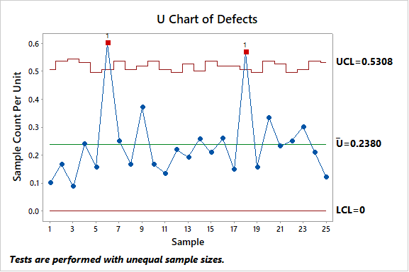
A LCD manufacturer wants to monitor the number of dead pixels on 21-inch LCD screens. Technicians record the number of dead pixels for each screen. Each subgroup has a different number of screens. The manufacturer uses a U chart to monitor the average number of dead pixels per screen.

Reference
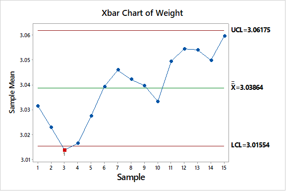
A quality inspector at a packaging industry wants to know whether the products are packaged within weight limits or not. During a process, he took a subgroup of 10 packets in an hour and plots a control chart to monitor the weight of a particular product.
Attend our Training Program, to know – “How can we achieve Quality Excellence in an Organisation?” We conduct various training programs – Statistical Training and Minitab Software Training. Some of the Statistical training certified courses are Predictive Analytics Masterclass, Essential Statistics For Business Analytics, SPC Masterclass, DOE Masterclass, etc. (Basic to Advanced Level). Some of the Minitab software training certified courses are Minitab Essentials, Statistical Tools for Pharmaceuticals, Statistical Quality Analysis & Factorial Designs, etc. (Basic to Advanced Level).
We also provide wide-ranging solutions for Enterprise Quality Management to achieve Organisational Excellence.