Scatter plot

Introduction

In a glass manufacturing industry scenario, we want to know whether the temperature and the chemical formulation is related or not. We want to check the relation – “How strong or weak it is?” It helps to identify the strength of the relationship between two factors and their cause and effect relationship. It is the fundamental tool in correlation and regression analysis.

Scatter plot was first introduced by Francis Galton to study the hereditary influence of parents to their children.

What is a Scatter plot?

Scatter plot is a simple graph where the data of two continuous variables are plotted against each other. The data values are plotted in the form of dots. It examines the relationship between two variables and to check the degree of association between them. One variable is called the independent variable and the other variable is called the dependent variable. The degree of association of a variable is known as correlation. We can state that it is a simple diagrammatic study to examine the correlation between the factors. The main purpose of a scatter plot is to depict the cause and effect relationship between the factors. Suppose in the automobile industry, the engineers want to find the relationship between the weight of a car and its mileage. They want to see how strong their relationships are and so it will help them in further improvements. A simple scatterplot suggests various kind of correlation between the factors.

Types of scatter plot

Let us check the types of scatterplot which describe the correlation between the variables.

Types-of-correlation
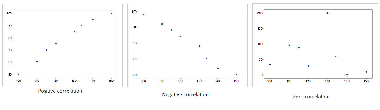
Generally, three types of correlation are mentioned above using scatterplots.

      • A positive correlation is a type of correlation between two variables when both the variables are changes in the same direction. When one keeps increasing and the other keeps increasing too.
      • A negative correlation is a contradiction to positive correlation. It means as one variable increases and the other decreases.
      • When there is no relationship between the variables and all the data points are scattered everywhere. In such a case, there is no correlation.

When to use scatter plot?

      • Data are numerical in nature.
      • To check the cause and effect relationships between the pair of continuous variables.
      • To identify the outlier in a process.
      • To examine whether there is a relationship exists between the variables.

Benefits

      • Easy visualization of the data variables or factors.
      • Plotting the graph is relatively simple.
      • To track the patterns or trends of data.
      • Best used for the optimization of a process.

Let us discuss some of the scenarios of various firms where scatterplots can be applied instantaneously.

      • Suppose in a manufacturing firm, the engineer wants to check the relationship between – machine efficiency & the production volume in a process or it can be demand & supply of products.
      • In another case, a medical researcher wants to study obesity in adolescent boys. Then he can use a scatterplot to find the relationship of fat percentage and body mass index (BMI).

Attend our Training Program, to know – “How can we achieve Quality Excellence in an Organisation?” We conduct various training programs – Statistical Training and Minitab Software Training. Some of the Statistical training certified courses are Predictive Analytics Masterclass, Essential Statistics For Business Analytics, SPC Masterclass, DOE Masterclass, etc. (Basic to Advanced Level). Some of the Minitab software training certified courses are Minitab Essentials, Statistical Tools for Pharmaceuticals, Statistical Quality Analysis & Factorial Designs, etc. (Basic to Advanced Level).

We also provide wide-ranging solutions for Enterprise Quality Management to achieve Organisational Excellence.

Create a Scatter Plot on a click of button by using MINITAB